
All your money, one number
A personal finance app for young professionals in Singapore. Every bank, brokerage, CPF account, policy and loan in one view, and an AI that explains your money in plain language.
Finora is a personal finance app for young professionals in Singapore. It brings every bank account, card, brokerage, CPF account, insurance policy and loan into one place, and adds them up into a single net worth.
On top of that sits Finora AI, which explains your finances in plain language: it answers questions about your money and points out the things worth a second look, so the numbers turn into something you can act on.
I designed it and built it myself in Flutter, so the project covered the product thinking, the interface and the working iOS app.
Money in too many places
A typical young professional here has a salary account, a savings account at another bank, a credit card or two, a brokerage app, CPF, a few insurance policies and maybe a study loan. Each one lives in its own app, and each app only shows its own slice.
So the simple questions are the hard ones. How much am I actually worth? Am I spending more than I earn? Is my money sitting in the right place? Answering any of them means opening five apps and doing the maths in your head, which is why most people never do.
That set the brief: one place that adds everything up, and then helps you understand what the total means.
One number first
Home leads with net worth, because it is the one figure that answers “how am I doing?” on its own. The trend chart under it can be dragged along to read any date, so the question becomes “am I doing better than last month?” rather than a single snapshot.
Everything below it answers the next question in order: what I own against what I owe, how much is cash, what each account is doing, and what is due next. The screen reads top to bottom like a summary, not a spreadsheet.

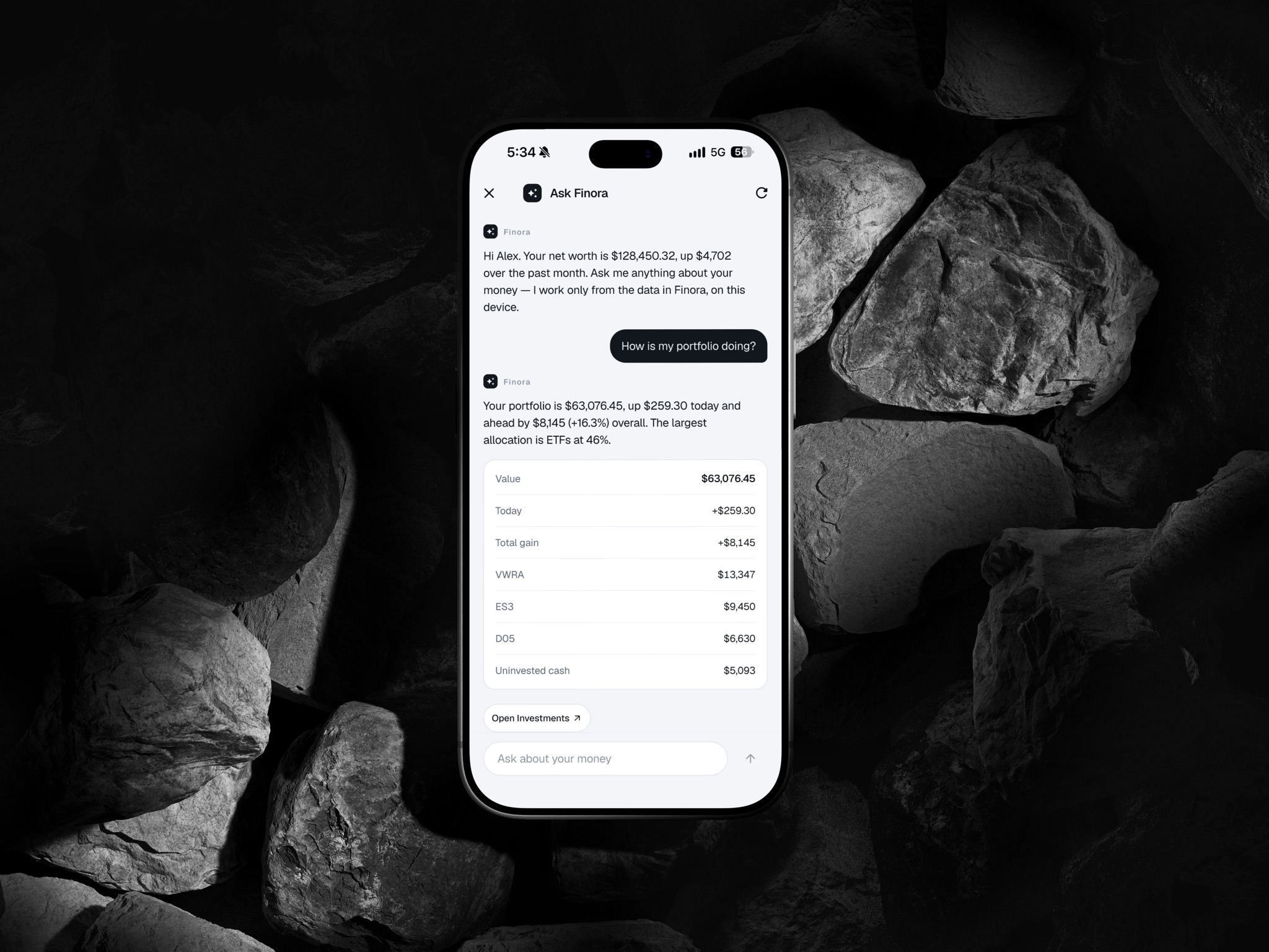
An AI that explains your money
A dashboard shows you numbers, but it assumes you know what to ask of them. Most people don’t. They have questions like “can I afford this?” or “am I saving enough?”, and no chart answers those directly.
Ask Finora uses AI to close that gap. You ask in your own words, and it replies with a short, plain-language explanation built from your own accounts, the figures it used, and a link straight to the screen where you can see more.
Showing the figures was the key decision. Money is a high-trust topic, and an answer you can’t check is an answer you won’t act on. It also explains rather than advises: it tells you what your numbers say, not what to buy or sell.
Noticing things for you
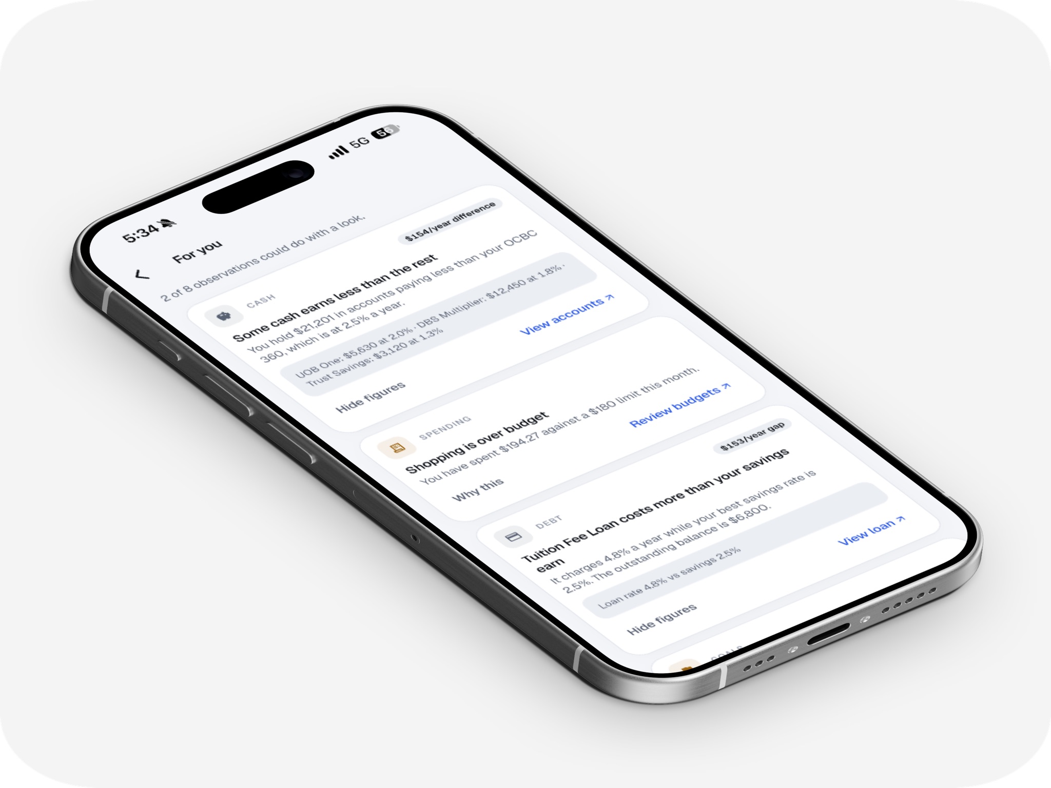
Even with a good assistant, people only ask about what they already suspect. The useful things are often the ones nobody thought to check: savings sitting in a low-interest account, a loan costing more than your savings earn, a budget quietly running over.
For you is Finora AI looking across every account and surfacing those observations without being asked, ranked by how much they matter. Each one has a “Why this” button that opens the figures behind it, and a link to act on it.
It keeps the list short on purpose. Flagging everything would train people to ignore it, so it only raises what is genuinely worth a look.
Where the money actually goes
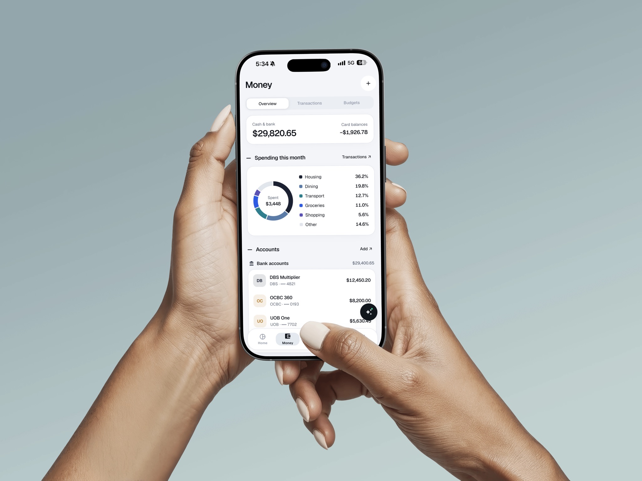
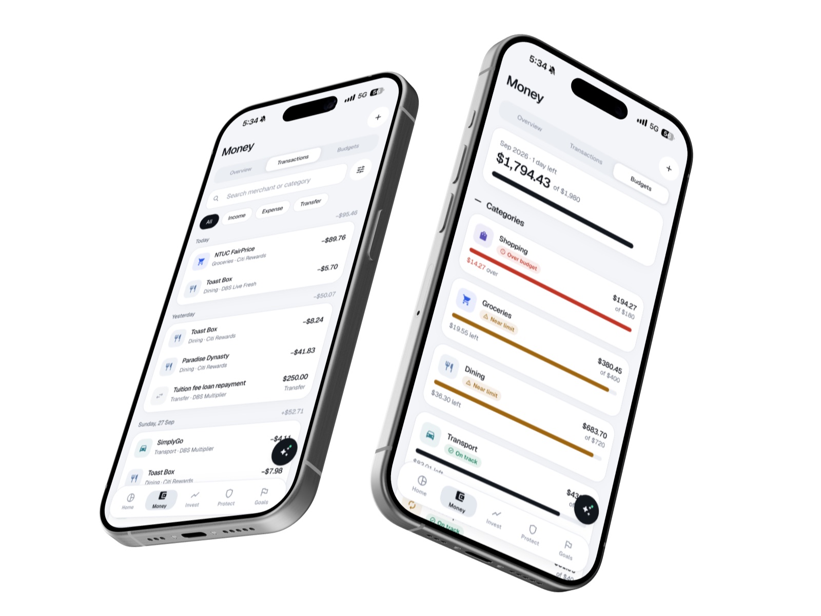
Money has three views, because people look at spending in three moods. Overview is the quick check: balances, spending by category and upcoming bills. Transactions is for hunting down one purchase, with search, filters and a list grouped by day. Budgets is for staying on track.
Each budget shows a state (on track, near limit or over) instead of just a progress bar. A bar at 90% can mean “fine” on the 28th and “trouble” on the 10th, so the state does that reading for you.
Investing, less intimidating
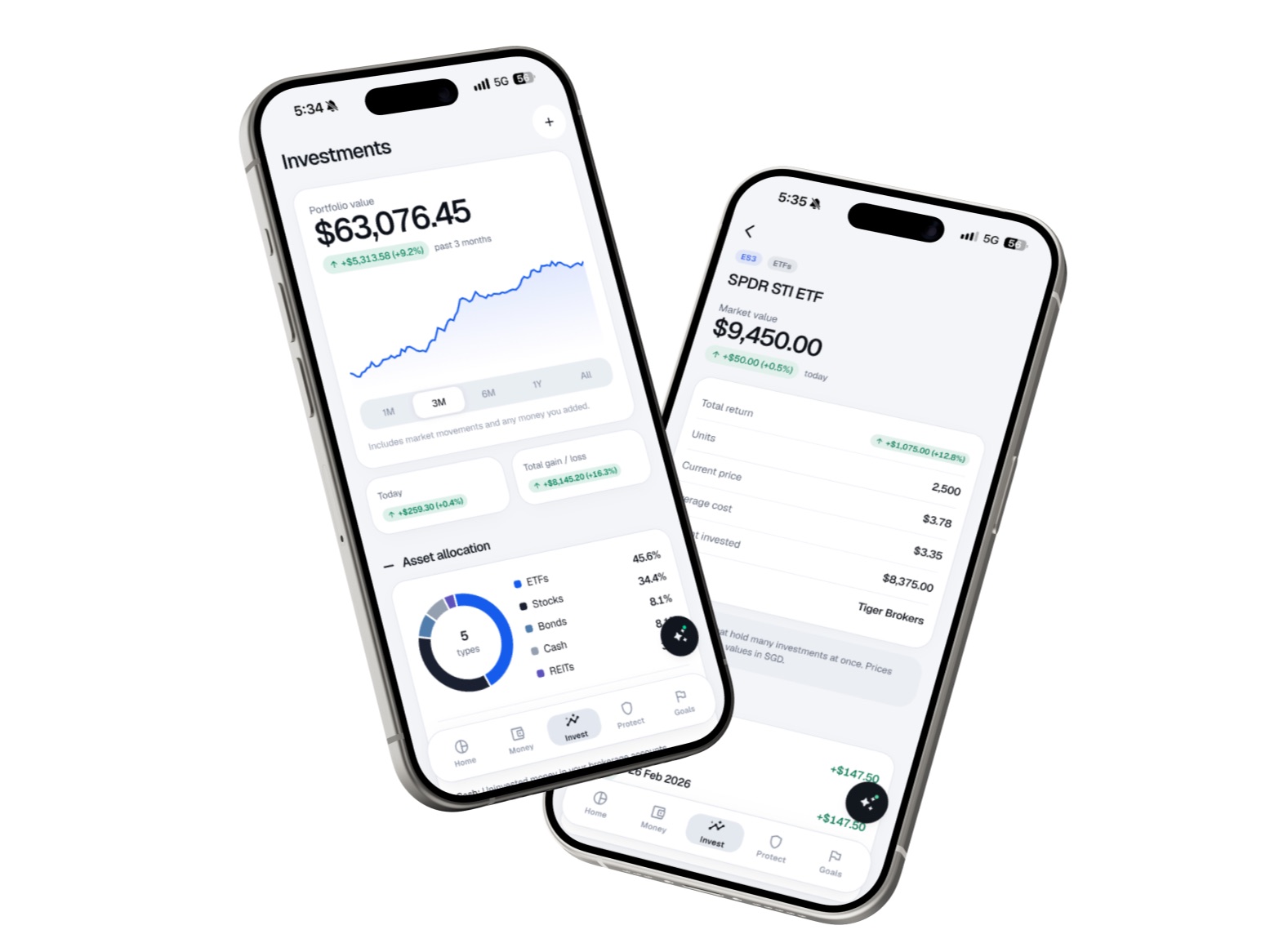
Plenty of young people own an ETF because someone told them to, without being sure what one is. Investments shows the usual portfolio value, returns and allocation, but pairs each asset type with a plain-language note on what it actually is.
It is a small addition that changes who the screen is for: not just people who already understand investing, but the ones who are still learning.
Planning ahead
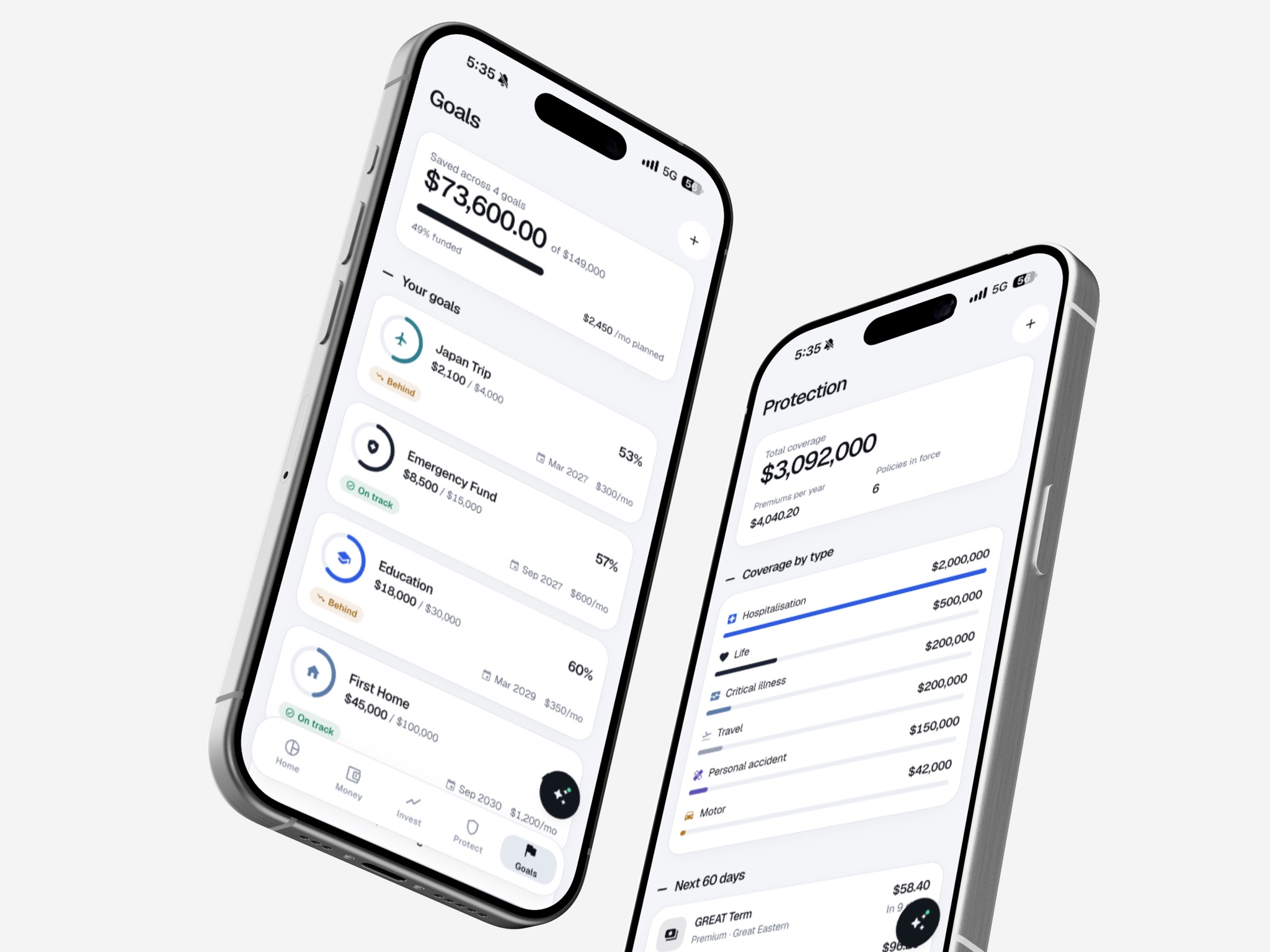
Protection gathers every insurance policy into one view and lists the premiums and renewals coming up, so a large annual payment is never a surprise.
Goals shows how far along each goal is, but more importantly the arithmetic behind it: what you would need to put in each month to hit the date, against what you actually put in. That turns “I’m saving for a house” into a clear on track or behind.
Designing for trust
A finance app has to feel calm and dependable, so the visual system is deliberately quiet: one cool-neutral palette, with a near-black surface reserved for the most important cards and buttons. Numbers use tabular figures so they don’t jitter as they change.
Gains and losses always carry an arrow and a sign as well as a colour, so the meaning never depends on telling red from green. And a privacy mode hides every amount on screen, for checking your balance on the MRT without anyone reading over your shoulder.
Building it in Flutter myself meant these details were decided in the real app rather than left in a mockup, including the unglamorous states like an empty account or a goal past its date.
More projects
View all projects



Like what you see? Let's talk.
I'm open to freelance projects and internships. Tell me what you're working on.
Get in touch