
Rescuing food before closing time
A food-rescue marketplace pairing hawkers with students and dormitory workers, turning unsold meals into 50–70% discounts before closing time. Same street, opposite problems.
SurplusGo is a food-rescue marketplace that connects hawkers, stall owners and restaurants with people nearby who will buy their unsold food at a discount before closing. Vendors recover revenue on stock they would otherwise bin, and buyers get a meal at 50–70% off.
It solves two problems that happen to fit together. Food businesses face unpredictable demand, especially during exam periods and holidays, and end the day with excess they cannot sell. Meanwhile the people living right beside them are highly price-conscious and want something cheap, close and quick. Same street, opposite problems.
We aimed it at students and foreign workers living in dormitories, and the timing is what makes that fit work: both groups are often still up late because of shift work or studying, which is exactly when surplus food appears. Anyone else can use it too. The public are welcome, they just were not who the product was shaped around.
I built the working prototype in Flutter, so the project covered product design, mobile development and the business model rather than screens alone.
Two problems, one marketplace
A vendor near closing has food with a few hours of value left and no way to reach anyone who wants it. A student or worker in a dormitory two streets away wants a cheap dinner and has no idea it exists. The gap between them is information, not distance.
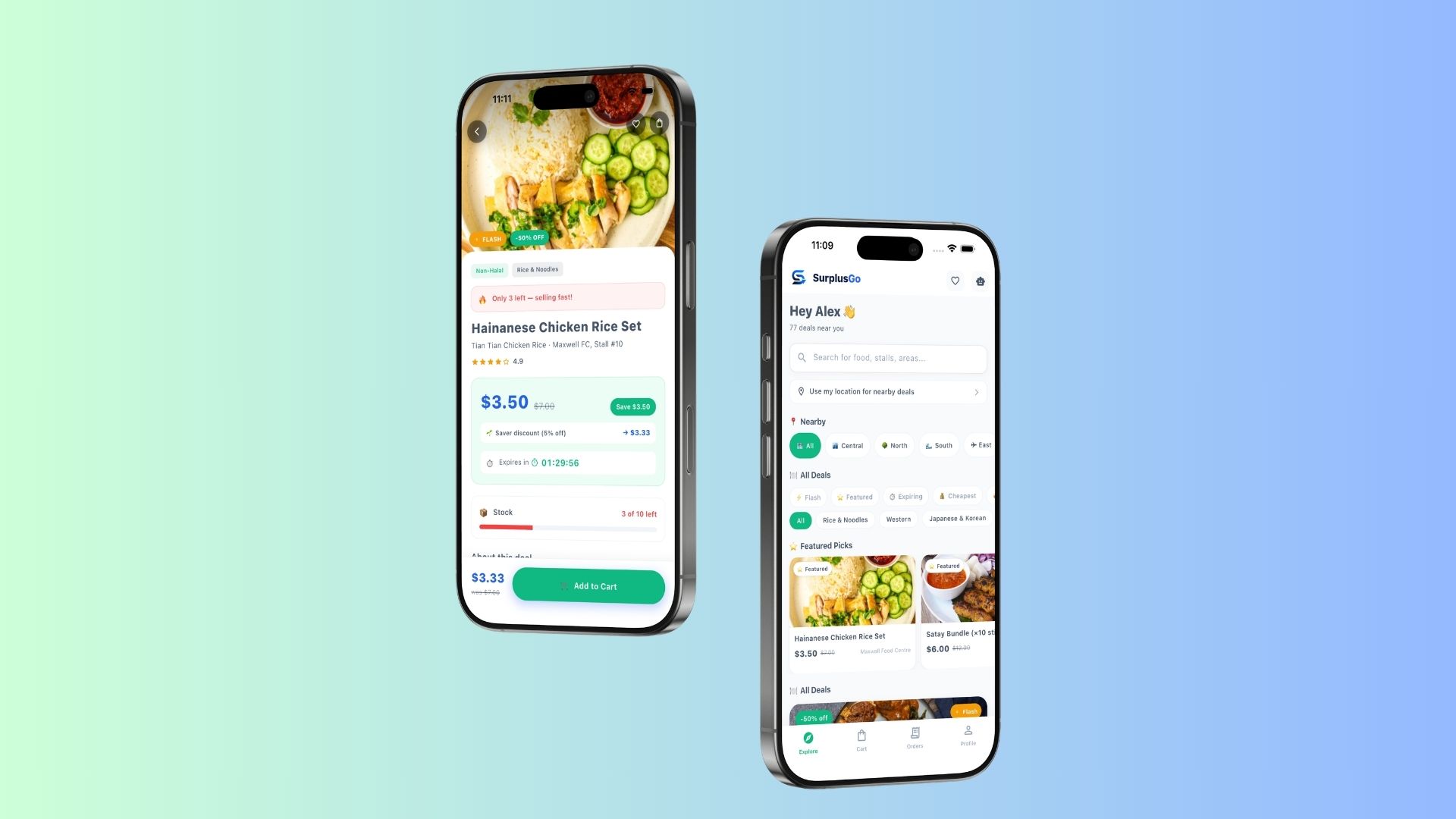
So the home screen leads with exactly that: how many deals are near you right now. No search required, no filters to configure. The useful state is the one you land on. Location, price and walking distance do the sorting, because those are the three things that decide a five-dollar dinner.
Prices that go up, not down
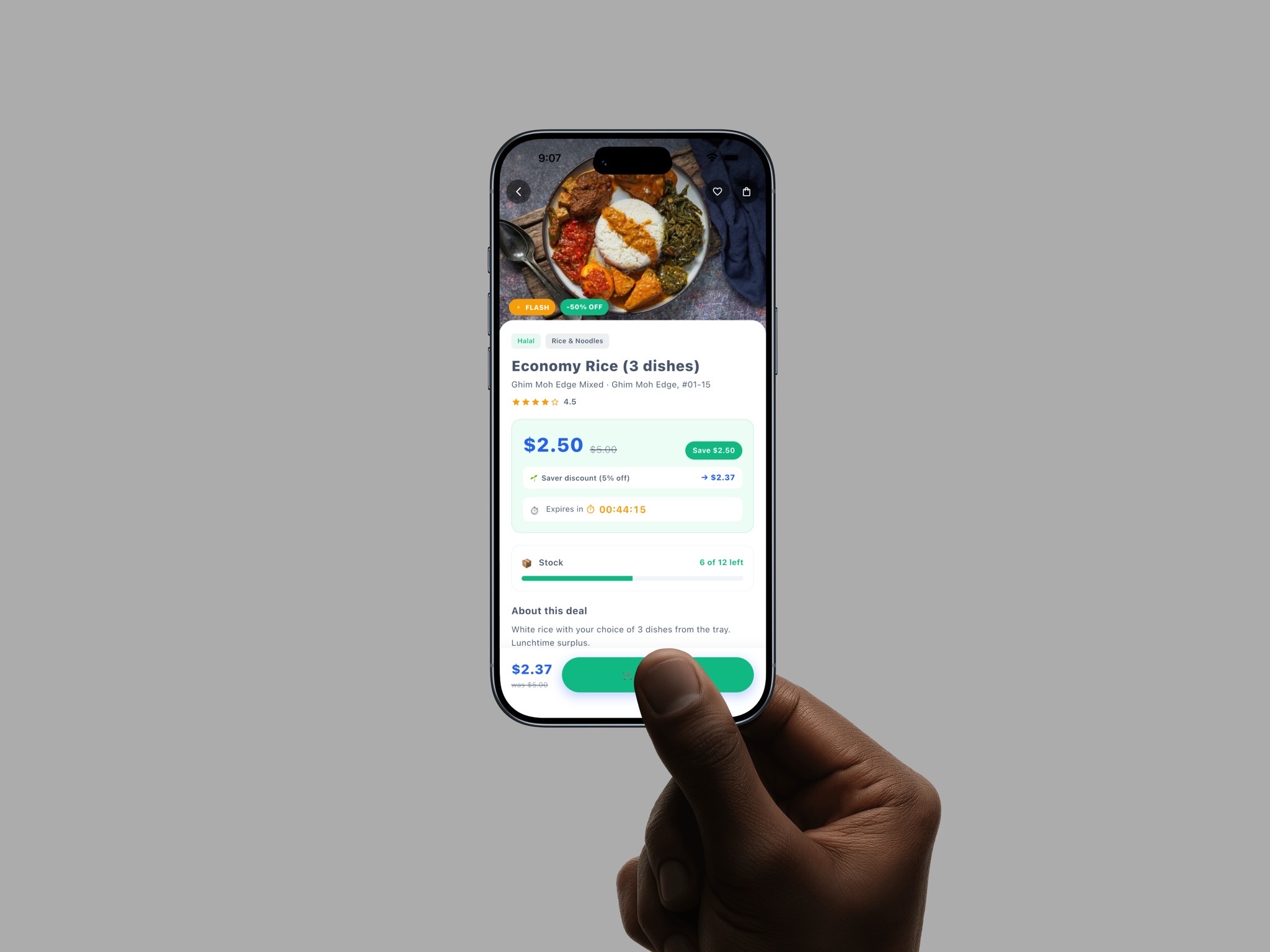
The obvious way to price surplus food is to discount it harder as closing approaches. We deliberately inverted that: the earliest buyers get the deepest cut, and the price climbs as the collection deadline gets closer.
The inversion solves a behavioural problem. Discounting toward closing teaches people to wait, hanging around near the stall for a last-minute markdown. That bunches every collection into the final minutes of a vendor’s day and leaves them uncertain whether the food will move at all. Rising prices remove any reward for camping, so buying early becomes the rational move and stock clears across a longer, calmer window.
The live countdown and remaining stock on each listing exist to make that legible. The saving is shown in dollars rather than only a percentage, because "save $2.50" lands faster than "50% off" when someone is deciding on the walk over.
Reserving without hunting for it
The catch with surplus food is timing. Listings appear unpredictably and the good ones go quickly, which means the app rewards whoever happens to be looking. That is a bad deal for someone in a lecture or on shift.
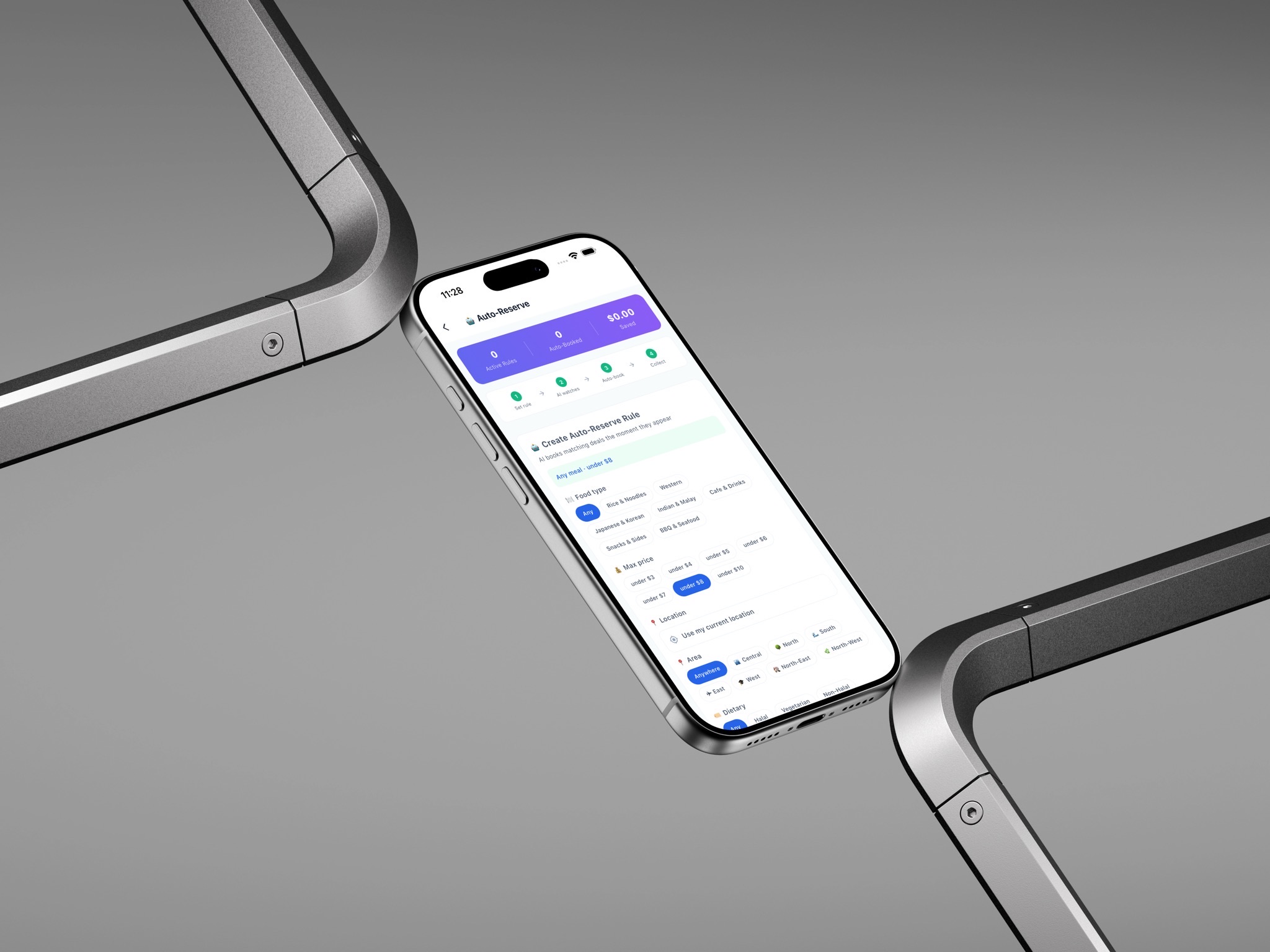
Smart Auto-Reserve fixes it. You set a rule once (a food type, a price ceiling, an area) and it books a matching deal the moment one is listed. It turns an app you have to watch into one that works while you are busy, which matters far more for a repeat habit than any single screen.
It also pairs with the rising prices. Since the cheapest moment is the instant a deal is posted, a rule that books immediately gets you the best price without needing to sit there refreshing. The two features only really make sense together.
Pay, then walk over and collect
There is no delivery. That was a deliberate constraint rather than a missing feature: delivery on a three-dollar meal destroys the economics, and the whole model is built around vendors who are a few minutes’ walk from a dormitory. Self-collection keeps the price low and the operation simple.
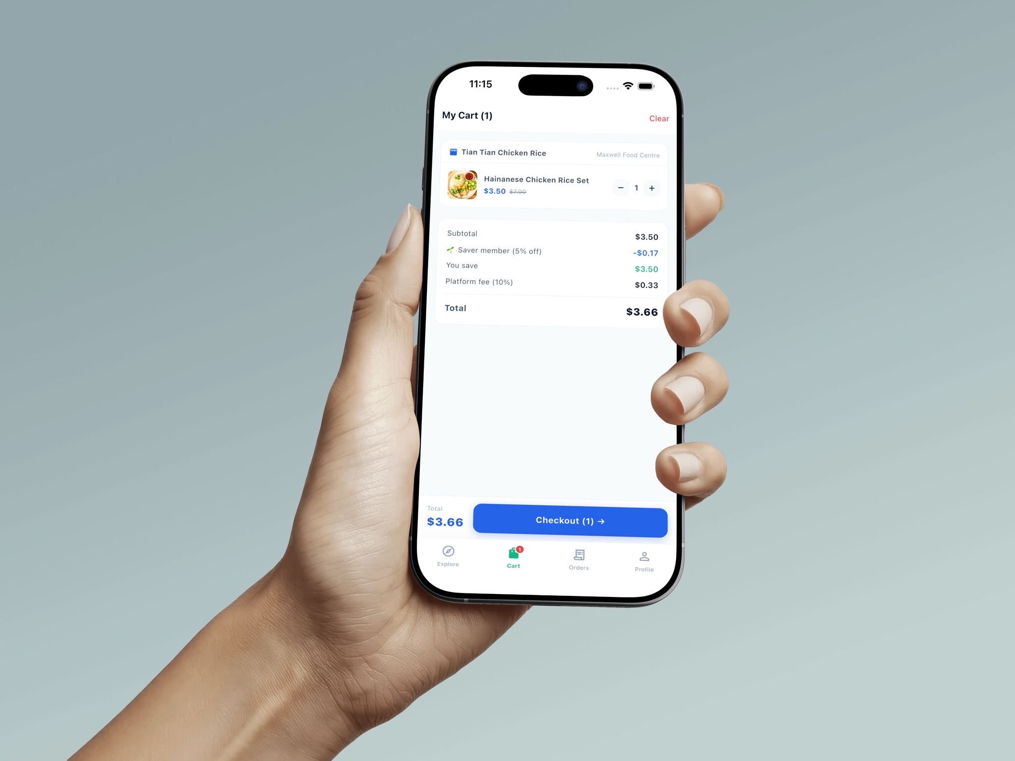
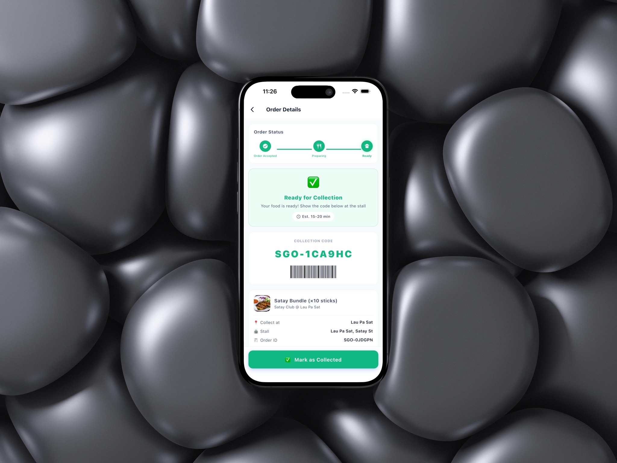
Which puts the weight on the handover. The order screen tracks status through to "ready for collection" and shows a code to present at the stall, so a hawker mid-service can verify an order in a couple of seconds without any new equipment. The cart also shows the platform fee openly instead of burying it in the total.
The other half: the merchant side
A marketplace fails if one side does not show up, and the vendor has less patience than the buyer. Listing surplus has to take a few steps at the busiest moment of their day, so that flow is deliberately short.
Beyond listing, merchants get a dashboard for inventory, sales and revenue, plus analytics on how much waste they have avoided, which reframes the platform from discount channel to something that reports a number they can be proud of. Featured Picks let a vendor pay for visibility, which doubles as a revenue stream for the platform.
Building the prototype in Flutter
My main contribution was building the thing. I designed and developed the prototype from scratch in Flutter, turning the team’s business concept into an application you could actually hold and use: discovery, listings, the reservation flow, cart, checkout and collection.
Building what I designed changed the design. Working in Flutter meant I found out immediately when a layout was awkward to implement or a flow needed a state I had not accounted for, so decisions got resolved in code rather than deferred to a handoff document. It also meant confronting the unglamorous parts that a static mockup lets you skip, like empty states, expired deals and sold-out listings.
It pushed the work past visual design into UX, mobile development and commercial reasoning at the same time: how someone discovers food, decides in under a minute, reserves and collects it, while the merchant side still makes sense operationally.
Making the numbers add up
A 10% platform fee on each transaction is the primary revenue stream. On the team’s projection of 120,000 annual orders at an average of S$5, that comes to roughly S$60,000 a year. Premium memberships add a projected S$53,916, and Merchant Featured Picks a further S$37,800, about S$151,716 in total.
Those are forecasts, not results, and the assumption doing the most work is order volume. But modelling it was the useful part: it forced the pricing, the fee and the membership perks to be design decisions with consequences rather than numbers on a slide. The 5% member discount and the 10% fee both appear in the checkout because they had to reconcile.
The outcome is a triple win on paper. Vendors recover revenue on food they would have thrown out, buyers eat for a few dollars, and less food goes to waste. What holds it together is keeping the network hyperlocal enough that walking to collect is genuinely easier than ordering delivery.
More projects
View all projects

Like what you see? Let's talk.
I'm open to freelance projects and internships. Tell me what you're working on.
Get in touch